In a world of feature-bloated platforms and constant digital noise, the mantra at Tempest Labs is "Radical Simplicity." This isn't just a catchphrase it's a design philosophy and strategic stance. If you've ever felt overwhelmed by the endless menus of Notion or the convoluted workflows of Jira, you're not alone. Many founders, CEOs, and product teams are starting to crave a different approach: tools that do less, but do it better. In this blog post, we'll explore the principles of Radical Simplicity, why minimal and distraction-free interfaces are backed by cognitive science, and how Tempest Labs applies this philosophy in its products and roadmap.
Radical Simplicity in practice: A clean interface that focuses on core functionality
What is Radical Simplicity in Software Design?
Radical Simplicity means stripping software down to the essentials and designing for clarity and ease of use above all else. It's a response to the feature creep and "kitchen sink" design that plagues many modern platforms. Instead of piling on features until an app can do 100 different things (poorly), Radical Simplicity opts to do a few core things extremely well.
This philosophy contrasts sharply with the likes of Notion or Jira, which, while powerful, have grown notoriously complex and cluttered over time. Consider Notion: originally beloved as an all-in-one workspace, it has steadily accumulated functionality project databases, wikis, embeds, and recently even AI and calendars. The result? Even devoted users are noticing that the tool "bloats an already packed interface" and presents "even more ways to daunt new users."
New features like AI assistants and third-party add-ons pop up as buttons and banners, demanding attention. What used to feel like a simple note-taking bridge now sometimes gets in the way of note-taking itself, making you wait on loading spinners and dismiss pop-ups. As one productivity writer lamented, "Notion has never been the simplest... nor the fastest. But lately, it feels like it's purposefully trying to make those facts ever more evident."
In short, an app once praised for versatility is inching toward the very bloat and friction that frustrate its users. Then there's Atlassian's Jira, practically a byword for software complexity. Jira is incredibly flexible and extensible boards, custom fields, plugins for every niche. But that strength is also its downfall. Teams often configure Jira into a tangled web of workflows and statuses. One engineer's critique put it bluntly: "Jira's overwhelming array of features often leads teams to spend excessive time managing their workflows rather than developing software." All those tickets, sub-tasks, and fields create cognitive overload, diluting focus and productivity.
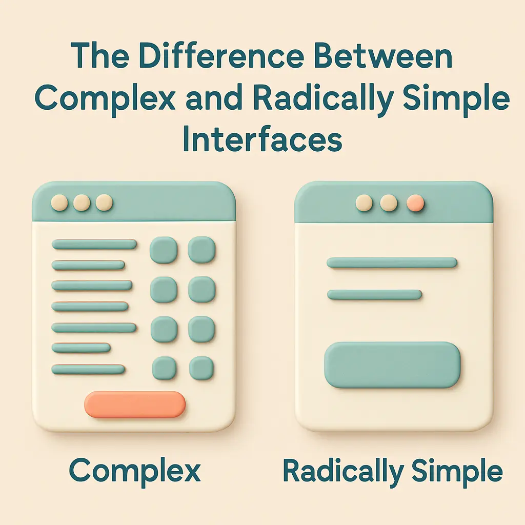
The difference between complex and radically simple interfaces
Over time, a Jira instance can become so bloated with customizations that teams spend more time curating the tool (endless grooming sessions, anyone?) than doing the actual work. It's the classic case of the tool overtaking its purpose the tail wagging the dog. No wonder some Agile teams rebel by reverting to simple index cards or spreadsheets, which "don't overwhelm team members with layers of abstraction and reporting mechanisms", letting them focus on real work.
Radical Simplicity stands in opposition to this bloat. Instead of an interface crammed with options, it champions focus. Instead of "more features," it asks "what is essential for the user's goal?" The goal is an experience where the software feels almost invisible a transparent bridge from intention to action. As design theorist Mark Weiser famously said, "the most profound technologies are those that disappear." Tempest Labs takes this to heart: its mission is to be the calm "space between notifications," not another source of digital noise.
Key Principles of Radical Simplicity
In practical terms, Radical Simplicity means no gratuitous bells and whistles, no gratuitous complexity. Every feature must earn its keep. If a function doesn't truly serve the user's objective, it's left out. The interface should invite you in, not intimidate you.
Clarity over breadth: Rather than cover every edge-case with a new feature or setting, design the default experience to cover the majority of needs clearly and simply. Edge cases can be handled gracefully without complicating the UI for everyone.
Guidance over options: Guide the user through workflows with smart defaults or gentle prompts, instead of presenting a blank canvas plastered with toolbar buttons. Too many choices at once can paralyze (a phenomenon we'll discuss more shortly).
Quality over quantity: Do a few things very well. It's better to have a fast, intuitive tool with 5 excellent features than 50 features that slow the app down and confuse the user.
Minimal distractions: No constant pings, pop-ups, or red badges crying for attention. Notifications are used sparingly, only for truly important events. The app should help you focus on your task, not constantly remind you it's there.
User control: Let the user pull information when needed rather than have the system push every update. For example, a manual refresh or a calm indicator can replace incessant auto-notifications.
Consistency and predictability: Use clear, consistent layouts and behaviors. A predictable interface reduces the mental effort needed to use it, aligning with the idea that "predictability reduces cognitive load."
Radical Simplicity isn't about dumbing things down or removing power it's about making the power accessible. A simpler tool can still be highly effective; in fact, it often ends up more effective because people actually enjoy using it (or at least don't dread it).
Tempest Labs in Practice: "No Noise, Just Clarity"
Tempest Labs is a young company, but its product design choices already showcase Radical Simplicity in action. The studio explicitly brands its software as "Power Tools for Productive Professionals" but power tools of a different kind. These are elegant power tools, favoring focus and flow over endless functionality.
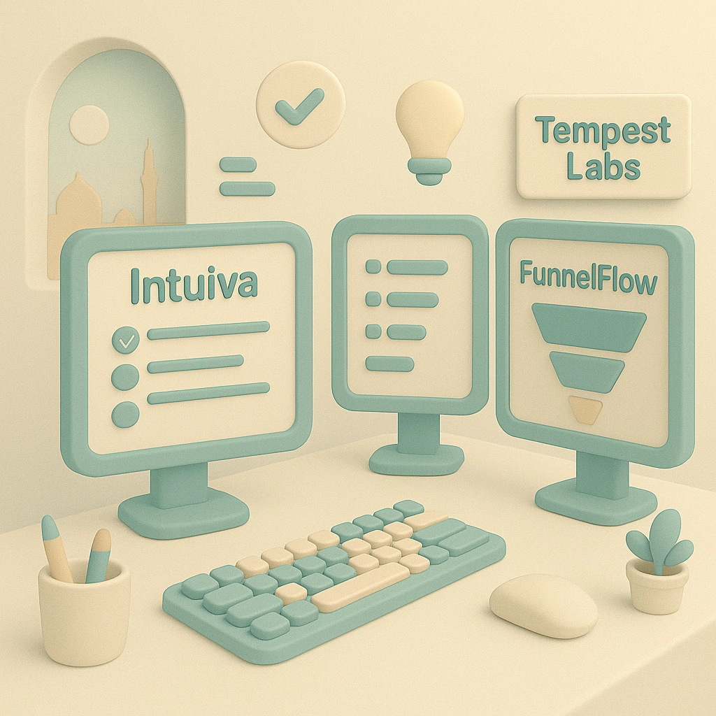
Focused, Purpose-Driven Apps: Unlike platforms that attempt to be a do-everything universe (looking at you, Notion), Tempest Labs creates dedicated tools each aimed at a specific domain. Currently, they offer Intuiva (a project planning and ideation tool), FunnelFlow (a visual sales pipeline manager), and a personal growth/journaling app called Cabinet of Selves. Each has a well-defined purpose and target user. This focus means the feature set can be tightly scoped to what those users need, without extraneous clutter. As the website explains, "Each product is meticulously designed to solve specific problems with elegant, intuitive solutions."
Clean Interface, Clear Workflow: Tempest's design mantra is clarity. For example, the FunnelFlow product page proudly touts: "No clutter, no confusion just a structured, streamlined view of your sales process." Open FunnelFlow, and you won't see dozens of modules or an onslaught of data tables. Instead, you see a visual funnel map that immediately answers: where are my leads and where are they dropping off? FunnelFlow's UI emphasizes visual clarity (color-coded stages, simple metrics) to turn "data confusion into actionable clarity." Setup takes minutes and there's "no steep learning curve." In other words, you can start using it without reading a manual the size of War and Peace. This is intentional: a tool that's easy to start using is a tool people will actually use (instead of procrastinating because they dread onboarding).
Minimal Notifications and Gentle UX: A core tenet at Tempest Labs is to reduce noise. The company calls its approach "Gentle Tech" technology that respects your attention. Concretely, this means features like notifications are used sparingly and thoughtfully, or omitted altogether when they're not truly necessary. For instance, FunnelFlow avoids the typical barrage of sales app notifications ("You haven't followed up with Lead X!" "You moved a card!" etc.). Instead, it focuses on providing value when you open the app a calm dashboard that's up-to-date whenever you need it, without pestering you when you don't.
One-Time Purchase Model No Engagement Tricks: Tempest Labs' business model (one-time purchase apps, no subscriptions) dovetails with Radical Simplicity. How? Subscription-based software often has a subtle incentive to maximize daily active use (you need to feel like you're getting your money's worth each month). This can lead companies to introduce engagement gimmicks, frequent "what's new" announcements, or interface changes to stimulate usage essentially adding to the noise. Tempest rejects this. "No subscriptions. No stress," as one of their blog headlines says. They deliberately went with pay-once ownership because they "didn't want to be part of the endless subscription fatigue" and digital noise that plagues users.
Every Feature Scrutinized (Roadmap Through a Simplicity Lens): One might wonder, as Tempest Labs grows and adds features, will it succumb to feature creep? The team appears acutely aware of this pitfall. On their site, they pledge that "Every feature is carefully considered to reduce cognitive load and enhance your natural workflow." New ideas go through a filter: does this genuinely help the user? Can we add this without cluttering the interface or complicating the experience? Being a small, founder-led company, Tempest has the advantage of saying "no" to features that don't fit their vision.
To sum up, Tempest Labs walks the walk. From UI design, to notification strategy, to pricing model, everything is aligned to create "calm software that feels human, quiet, and useful." The products aim to be the antidote to overwhelm the tool that helps you breathe, not break your brain. It's a refreshingly opinionated stance in an industry that often chases trends and feature checklists.
Conclusion: Clarity as the New Competitive Edge
As we've explored, "Radical Simplicity" is more than a buzzword it's a necessary counterbalance to the chaotic state of many digital tools today. It's about rejecting the false doctrine that more features automatically mean more value. Instead, it's about designing products that respect the user's time, attention, and intelligence. Tempest Labs exemplifies this approach: from its manifesto of building "tools that do not shout, scroll, or steal your focus" to the very tangible way Intuiva and FunnelFlow function, it has bet the company on the premise that users are craving less complexity, not more.
For founders and product leaders, the takeaway is both inspirational and practical. On one hand, it's a call to build software that actually empowers rather than overwhelms. On the other, it's a reminder that focusing on core usability and user well-being can be a winning strategy, not a sacrifice. Yes, it might mean saying "no" to feature requests that don't align with a clear vision. It might mean spending extra time refining a workflow so that it's intuitive instead of just shoving in a tutorial to explain a confusing design. But the reward is a product that users form a positive relationship with one they'll rave about because it makes their life easier and calmer.
In a business context, that kind of user love translates to strong retention, organic growth, and a brand that rises above the noise. For our ADHD entrepreneurs, our perpetually interrupted project managers, our CEOs with 1,000 decisions a day Radical Simplicity is like a sanctuary. It's technology on your side, not adding to your burden. Imagine starting your workday and your tools almost fade into the background, letting you flow on what matters. That's the vision Tempest Labs is chasing. And they're not alone; the industry at large is starting to recognize the pendulum had swung too far toward complexity, and now simplicity is the new innovation.
To quote the Tempest manifesto in closing: "Choose silence. Choose clarity." In choosing software that embodies Radical Simplicity, you're choosing to protect your focus and sanity in the digital storm. And for those of us building the next generation of tools, perhaps it's time to join this "quiet rebellion" to create products that succeed not by being the loudest or most packed, but by being the most thoughtfully simple. After all, in the long run, the products that help users breathe will outlast those that make them drown.
Experience Radical Simplicity
Explore our products built with the same calm philosophy.
See Our Tools